
Lifting Labels
Brand Identity & Digital
Presence Redesign
Role: Design Consultant + Community Care & Studio Manager
Organization: Lifting Labels, a Social Enterprise Nonprofit
Scope: Brand identity refresh, website redesign, marketing collateral
Tools Used:
Google Workspace, Shopify, Jotform, Canva, Adobe InDesign, Adobe Illustrator, Videoleap
Lifting Labels is a Baltimore-based social enterprise providing meaningful employment to formerly incarcerated individuals through sewing production. While the organization had a powerful mission, its visual identity and digital presence didn't effectively communicate professionalism, impact, and quality.
Key Issues:
Outdated website that lacked cohesive, strong storytelling
The functionality of the website wasn’t successful at centering the user
The website didn't showcase product quality or mission impact
Inconsistent brand identity across touchpoints. The organization had no sense of what the true brand identity is.
Marketing materials weren’t impactful and didn't reflect strong brand messaging and the organization's values
The Challenge

Website Redesign
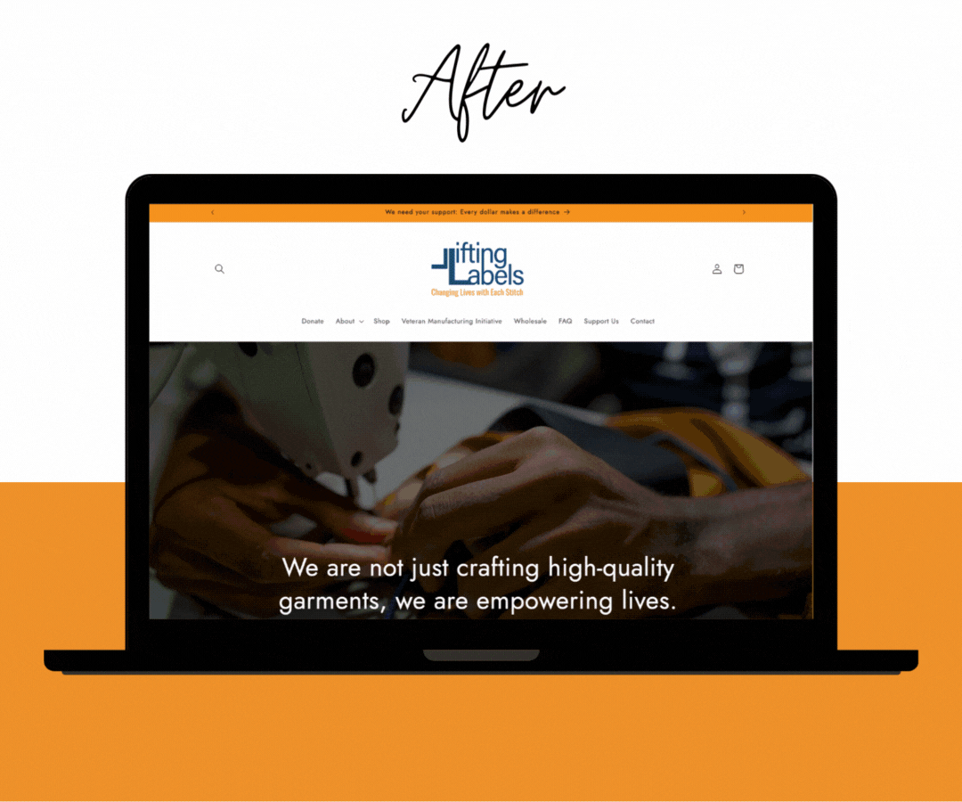
What We Did:
Transitioned the website from Wix to Shopify to better support operations as a product-based initiative
Created a clean, professional site centered on the community of Lifting Labels, values, and mission impact
Improved photography that highlights our values, people, and customers
Built quick and accessible ways to donate
Implemented clear messaging
Improved user experience with intuitive navigation
Mobile-responsive design for accessibility
Impact: Enhanced credibility with institutional clients and donors; improved online presence
Logo Refinement:
Refined existing logo for better scalability and versatile formats
Brand Book Development:
Identified the color palette
Identified & established Typography guidelines
Logo usage standards
Brand voice and messaging framework
Established photography style guidelines
Impact: Consistent, professional brand presence across all touchpoints that can be understood by anyone interacting with the organization
Brand Identity System

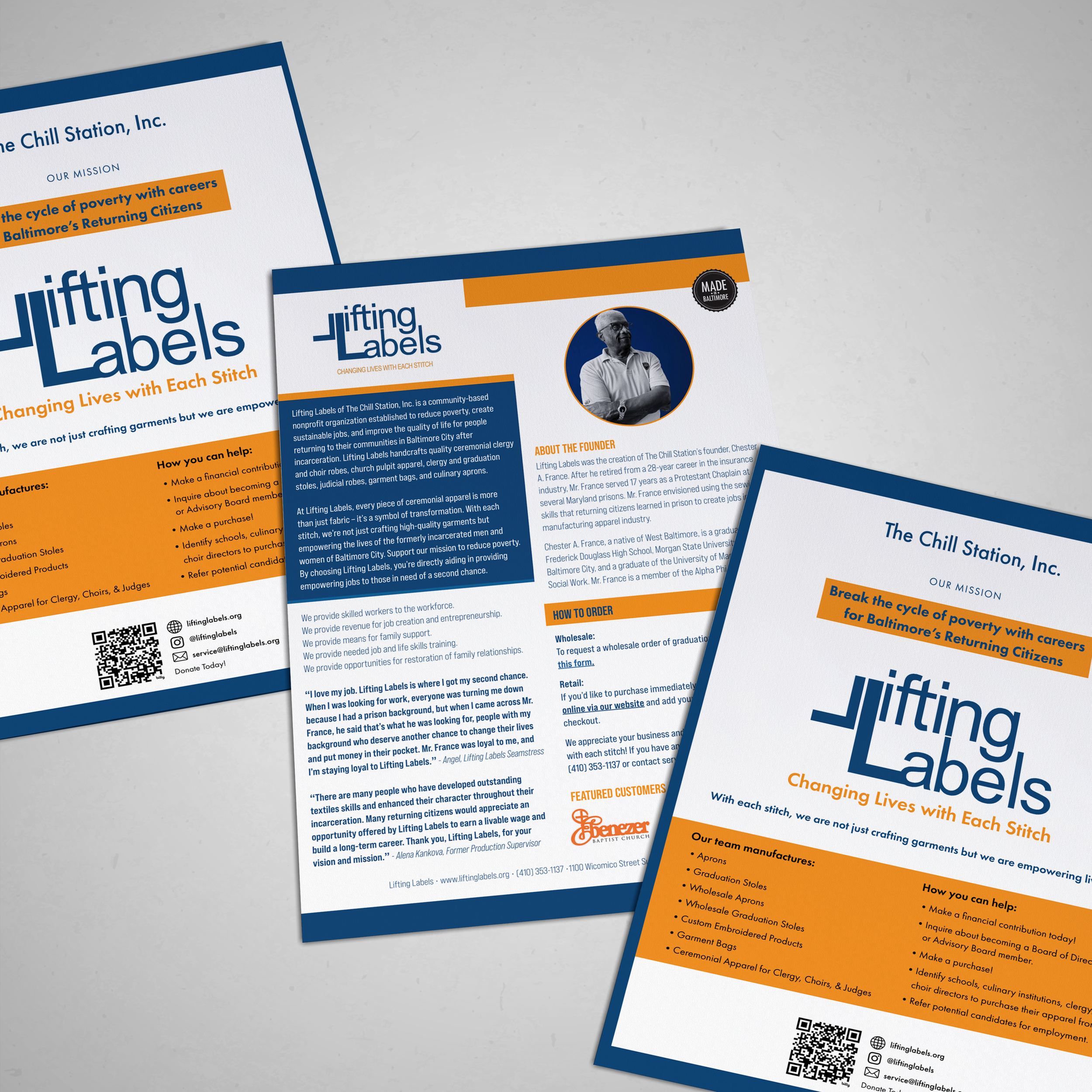
Postcards & Brochures:
Redesigned promotional materials to clearly communicate mission
Balanced compelling visuals with accessible information
Created templates for easy staff updates
Packaging:
Improved packaging that reinforces brand quality
Improved unboxing experience to center gratitude
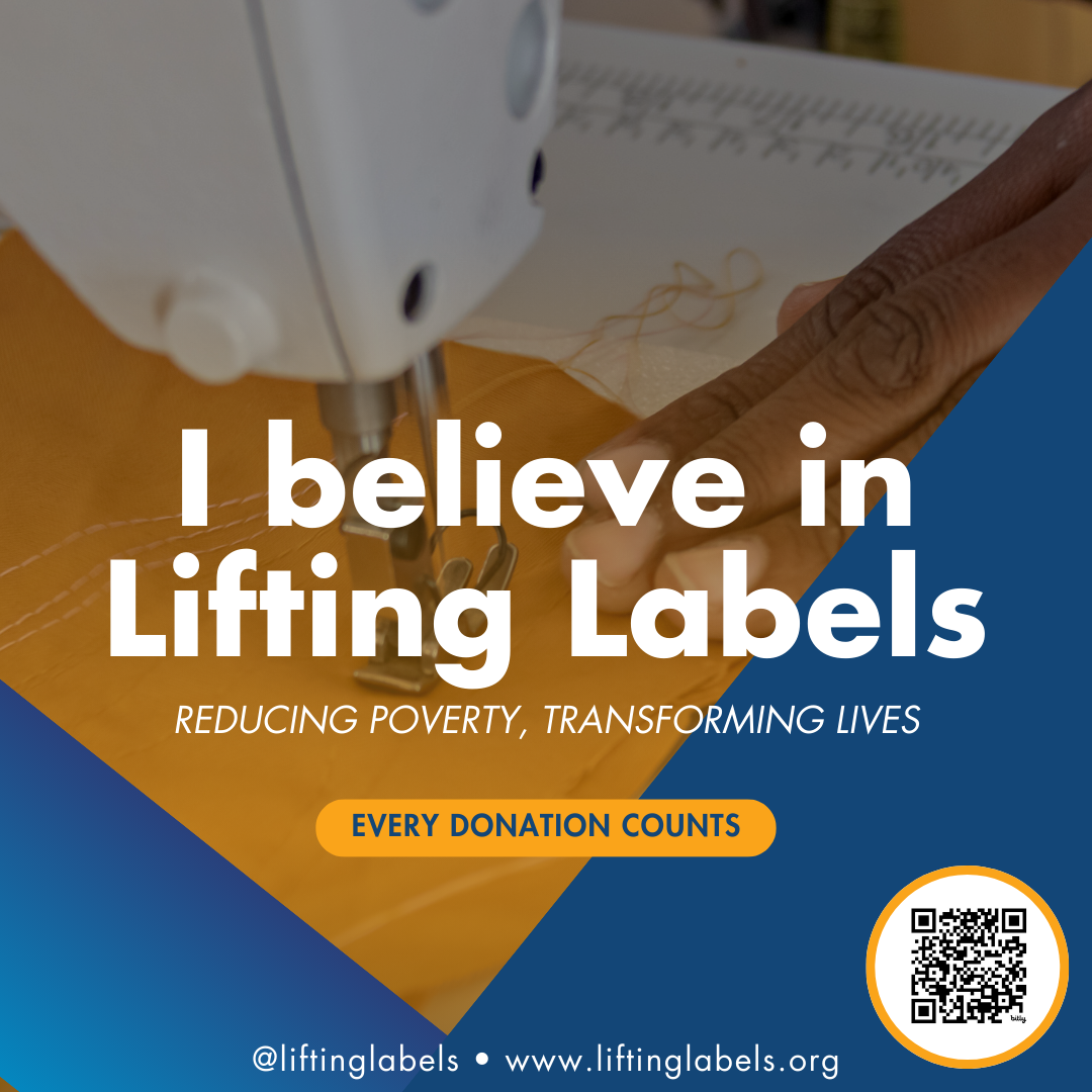
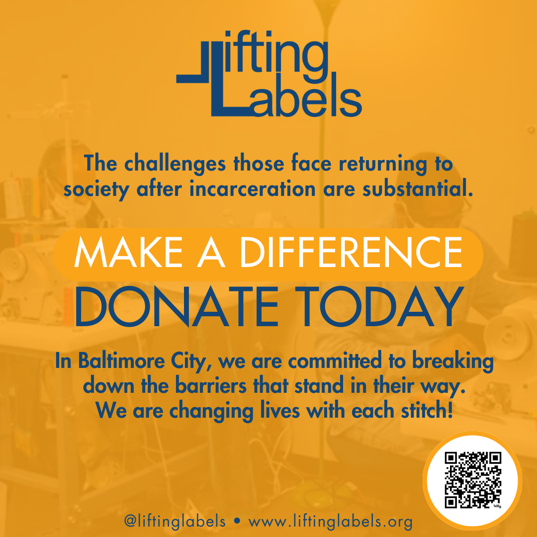
Social Media Graphics:
Branded templates for consistent visual presence
Graphics highlighting products and people
Fundraising campaign assets
Marketing Collateral


In my employment role, I developed operational systems designed specifically for a team with significant technology barriers—all members are 55+ in age, two are currently incarcerated with limited tech access, and most have minimal digital literacy.
The Challenge: The organization relied heavily on the founder's one-on-one communications via personal email and phone. The production team lacked equal access to project requirements, resulting in errors and inefficiencies. Systems needed to bridge significant tech gaps while creating accountability.
Solutions Delivered:
Multi-Entry Point Systems
Designed both physical and digital tracking systems, recognizing varying comfort levels with technology
Created physical wall calendars and queue boards alongside digital spreadsheets for implementing project tracking
Ensured critical project information was accessible regardless of tech proficiency
Streamlined Communications
Set up Google Workspace for organizational credibility and centralized communications
Developed forms, reducing reliance on founder's direct email/phone management and ensuring everything needed is accounted for
Created clear documentation accessible to team members with limited digital experience
Impact: Reduced founder's manual communication workload, empowered team members to access project information independently (regardless of tech comfort), decreased production errors through clearer information sharing, and created systems maintainable by staff with varying digital literacy levels.
Operational Systems
Results
Streamlined operations through clear processes and tracking systems
Reduced manual work for founder by creating accessible, standardized systems
Improved team efficiency with consistent project information accessible to all staff
Professionalized brand presence that represents quality and mission
Improved digital presence communicating product and purpose
Enhanced customer confidence through cohesive communications
Strengthened visual identity honoring makers' dignity
Skills Demonstrated:
Operational systems design
Process improvement and documentation
Workflow optimization
Brand identity development
Website design for E-Commerce
Mission-driven marketing collateral design
Social media graphics
Stakeholder collaboration
Reflection
This project exemplifies my approach: starting with organizational mission and community needs, then creating both visual systems and operational processes that serve the work. At Lifting Labels, every design decision honored the dignity of the makers while meeting professional standards. But beyond aesthetics, I recognized that a small nonprofit team needed systems that worked as hard as they did.
By creating standardized processes for project tracking and client onboarding, I reduced the manual work that previously fell to the founder and made critical project information accessible across the entire team. The result is a brand identity that authentically represents transformation, quality, and empowerment—paired with operational systems that actually support the daily work of changing lives with each stitch. Design and operations working together to serve both the mission and the people doing the work.